Thursday, May 16, 2024

Warmer Stripes for 2023

visualization showing average global temperaures for every year since 1850 as colored stripes
average global temperatures since 1850

Ed Hawkins' Warming Stripes visualization has now been updated to include 2023. Last year was the warmest year since accurate global records began. Globally the average temperature was 1.18°C (2.12°F) above the 20th-century average of 13.9°C (57.0°F). This means that your local warming stripes will probably now end with a very dark maroon colored stripe representing last year's intense heat.

#ShowYourStripes uses historical climate data to visualize average temperatures around the world for the last 173 years. Each stripe represents the average temperature for a single year, with reds signifying warmer than average years and blues cooler than average years. On the visualization stripes are ordered chronologically so that the stripes depict a clear warming trend over time. The most recent stripes, representing the last few decades, are predominantly red, highlighting the accelerated pace of global heating.

#ShowYourStripes also now includes an interactive map. The map allows you to zoom in on areas of the world to view the warming stripes for individual cities. Click on a marked city and you can view its warming stripes in an information window, click-through to view the city's warming stripes in more detail, and download the stripes as an image.

Wednesday, May 15, 2024

Is Europe Ready to Burn?

map of Europe showing all megafires since 2000

This week Spanish news site El Diario wondered if Europe was ready for megafires. One of the most noticeable consequences of global heating over the last few years has been the increase in large wild fires across the world. 

In Megafires Burn Europe El Diario has mapped out all the wildfires in Europe this century which have burnt an area of more than 500 hectares. Two accompanying graphs show both the increasing frequency of these large fires in Europe and their increasing size over the last decade.

The El Diario map of this century's magafires shows that southern Europe is most affected by wildfires. Portugal, Spain and Greece respectively have experienced the most area burnt by megafires. In its article El Diario uses a storymap format to highlight some of the areas which have seen the largest concentration of these fires.

El Diario is unequivocal in blaming climate change for the increasing severity of wildfires in Europe and note that the 'situation is going to get worse'. They say that according to climate change projections by the end of this century Spain, Italy and Greece will experience between 20% and 40% more days when climate conditions are favorable for the expansion of forest fires.

Via: Data Vis Dispatch

Tuesday, May 14, 2024

Welcome To Your New Gardening Zone

map of Miami showing its new plant hardiness zone (11a)

In November of last year the US Department of Agriculture (USDA) updated the US plant hardiness map based on the latest weather data (1991–2020). The USDA Plant Hardiness Zone Map is a tool which is designed to help gardeners determine which plants are most likely to thrive in their location. 

The USDA map is divided into 13 zones based on average coldest temperatures. Zone 1 is the coldest zone, with average annual minimum temperatures below -55°F, while Zone 13 is the warmest zone, with average annual minimum temperatures above 65°F.

NPR has released a new interactive map which allows gardeners to discover their new plant hardiness zone and what this means for their gardens. Enter your location into the article, The USDA’s gardening zones shifted. This map shows you what’s changed in vivid detail, and NPR will show you your new plant hardiness zone, and the lowest average temperatures in your zone. The map will show you how much warmer this is than your previous average lowest temperatures.

As well as allowing you to discover your new Plant Hardiness Zone the NPR article does a very good job at explaining what the zones do and don't tell you about the kinds of plants that you can and can't grow in your garden. It explains how different locations within the same zone can still have widely different climate conditions which can affect which plants will thrive in your particular garden and climate.

Monday, May 13, 2024

Can You Draw America?

a satelitte map of the US on which an idiot has tried to draw the outlines of a few states

This morning I discovered that my geographical knowledge of the United States is ten times worse than I previously thought. Judging by my attempts to draw the outlines of all 50 states onto a blank map of the U.S. my application to the American Geographical Society is probably going to be summarily rejected.

Regular readers of Maps Mania (yes both of you) may remember that in March I posted a link to Huge Quiz's Europe Country Drawing Challenge. In this game players are challenged to draw the borders of European countries on top of a satellite map of Europe. For each country drawn points are awarded based on how much of the drawn area contains the actual named country and how much of the actual country is contained in the drawn area.

In March I discovered that I have a very bad knowledge of basic European geography. Today I learned that my knowledge of American geography is even worse. So far I have attempted to draw ten states in the U.S. State Drawing Challenge. I managed to score 0 points for Maine, Nevada, Montana, and Nebraska. The only two states I have managed to draw with any reasonable accuracy so far are California and Washington.

Due to the costs of using the Google Maps API Huge Quiz periodically restricts access to its games to premium members. This week the Europe Country Drawing Challenge is restricted. However (at the time of writing) the U.S. State Drawing Challenge is available to anyone.

Saturday, May 11, 2024

Active Video

screenshot of Eyes in the Prize showing the video, map and timeline

Glen Chiacchier has devised an interactive mapped, timeline for the American civil rights documentary Eyes on the Prize. His 'active video' of Eyes on the Prize turns what might otherwise be a passive viewing exercise into an active learning experience by providing viewers with the opportunity to browse the documentary by date and location. 

The civil rights documentary Eyes on the Prize was a 14 part history of the 20th-century civil rights movement in the United States which originally aired in the late 1980s. Glen's 'active video' allows you to watch and explore Episode 2 - "Fighting Back (1957–1962)".

Instead of passively watching the video Glen's active video allows you to browse the video by location (using place-name links on an interactive map) or by date (using links on a chronological timeline). A transcript of the video is also provided, with space for viewers to add their own annotated notes on sections of the documentary. 

Glen notes that the "video can still be enjoyed passively if desired, but now viewers have a low-friction way of engaging further." The format is particularly useful for research. Most 'academic' reference books contain contents and index pages, which help students and researchers to quickly access the information that they need. This kind of 'active video' template really could help students and researchers browse and reference video documentaries. 

Friday, May 10, 2024

The Secret Life of Bridges

an animated map showing the cumulative growth of bridges in the U.S. since 1800
This amazing animated map visualization shows the cumulative growth of bridges in the U.S. since 1800. The map reveals the development of mass transport over the last two centuries and the enormous role that bridges play in the U.S. economy.

The animation is just one of a number of impressive mapped visualizations in Esri's Secret Life of Bridges. The Secret Life of Bridges is an Esri story-map which looks at the history of bridge construction and also explores the current condition of the country's contemporary bridges. There are over 618,000 bridges in the United States. Esri says that "roughly one out of every 13 bridges - about 46,000 in total - are considered to be in poor condition". 

Using interactive mapped visualizations of the grades awarded to bridges every four years by the American Society of Civil Engineers Esri has identified the areas of the country with the highest proportion of bridges in a poor condition. This helps to pinpoint the regions of the United States which are most in need of investment. The Secret Life of Bridges includes an interactive map which colors each county based on the percentage of its bridges in a poor condition. Click on a county on this map and you can view the country's total number of bridges, the average age of the bridges and the percentage deemed to be in a poor condition.

Thursday, May 09, 2024

Virtual Road Trips

screenshot showing the map,street view image and current status of the America - Road Trip Simulator
This summer why not go on that huge cross-country road-trip that you've always dreamed of undertaking? The great American Road Trip is a call to freedom. It is a chance to craft your own adventure while witnessing the vast beauty and the diversity of landscapes that America has to offer. Whether you crave the thrill of the Pacific Coast Highway or the charm of Route 66, a road-trip promises you the experience of a lifetime.

Alternatively you could avoid the unimaginable drudgery of endless hours of driving by staying at home and following the America - Road Trip Simulator instead. Simply open up a beer, lie back on your comfortable couch and take a virtual journey across America all from the comfort of your own home.

The 'America - Road Trip Simulator' styles itself as a 'serendipitous journey unfolding at your own pace'. Open it up and it will take you on a real-time simulated trip across the United States. The simulator uses a number of Windows 95 styled windows to provide you with information about the progress of your virtual road-trip. 

One of these windows provides you with a live animated map of the current location of your virtual vehicle. Other windows allow you to listen to a local radio station, view an image of your location from Mapillary, view Wikipedia articles of nearby points of interest, read local news stories, find nearby cafes and restaurants and view local classifieds from Craigslist. You can also open up a status window which provides you with a little data on your great American road-trip (currently I have been travelling for 46 minutes, have driven 36 miles and have visited only 1 state).

animated GIF of virtual cars moving around of a map of Virtual World
If the thought of traveling virtually across the whole of the United States feels a little too challenging then why not try a smaller virtual journey instead? If you haven't got the time (or inclination) to explore the whole country then why not take a little local drive around a small town on Virtual World

In this virtual world a number of virtual self-driving cars drive around navigating a virtual town, while trying not to collide with each other. You can use the drop-down menu to select a number of destinations for your vehicle. If you click on the steering wheel icon then you can take control of the car. This allows you to steer the car and to control the car's acceleration and brakes (on my laptop the arrow keys are the control keys).

Wednesday, May 08, 2024

The Future of Street View

animated GIF of a gaussian splatting 3d model of a street scene embedded into Google Maps

In 2007 Google began adding 360 degree panoramic images to Google Maps. It is no exaggeration to say that the introduction of Street View revolutionized online mapping. Now users could not only zoom into their neighborhoods in satellite view but they could also virtually explore their area in Street View.

It is almost impossible to predict the next major revolution in online mapping. For a couple of years now I've been thinking that photogrammetry was going to provide the next break-through in the online mapping experience. The amazing virtual 3D model of Tunet pÃ¥ HavrÃ¥, and those exhibited on Iconem Exploration hint at one way an accurate interactive 3D virtual map of Earth could be created using models created through photogrammetry.

Creating a high-fidelity global 3D map of Earth enhanced with interactive photogrammetry models of key locations is a huge complex task which requires access to a huge number of high-resolution images. Creating a photogrammetry model of a location on its own is still an intensive task. Once a 3D model has been created making it accessible on a 3D map, and user & device friendly is pushing the boundaries of what is currently technically achievable.

One thing that may accelerate this process is Gaussian Splatting. Gaussian splatting is a relatively new technique in computer graphics used for rendering 3D scenes. It is able to create 3D models from multiple images of a scene by creating a point cloud. Gaussian splatting excels at capturing details in 3D scenes. By adjusting the size and distribution of Gaussians, it is possible to focus detail on specific areas without needing complex geometric models. In short it has huge potential for creating high-quality 3D scenes.

Kieran Farr has created a Splats and Map demo which embeds a 3D Gaussian Splatting model of a street scene into an interactive Google Map. As you can see from the animated GIF above a 3D model has some huge advantages over Google Maps Street View. Instead of being confined to navigating from one 360 degree panoramic image the user is free to pan and move around a 3D scene at will. 

One of the most impressive aspects of Kieran's demo is the speed at which the map works on even fairly low level devices. It suggests that it is possible to create an interactive map which incorporates a few 3D models of important locations within a city. It isn't even too hard to imagine that in a few years time Google Maps will be one huge interactive 3D model of the Earth.

Monday, May 06, 2024

Hexagen World

screenshot of hexagen world showing lots of user generated hexagon images

Hexagen World is a game world generated by players using AI prompts. The game is similar to the popular r/Place project. However in Hexagen World instead of users adding one pixel to a collaborative image they can add AI generated hexagon tiles to a world map.

Register with Hexagen World and you can add your own hexagons to the map. Just click on a blank hexagon and enter an AI prompt to generate your map tile. Each hexagon you add to the map costs 100 points. 

Initially you can only add 3 hexagons to Hexagen World but you can earn more points each day based on your 'creative points'. Each time you add a hexagon your creation is awarded 'creative points'. You can then harvest these points every day. Earn enough points (100) and you can add another hexagon to the map.

animated GIF of a globe of the Earth made from plasticine

While exploring Hexagen World you might find a few hexagons based on real world locations. So far I've spotted the Statue of Liberty, lots of Chichen Itza inspired pyramids, the Colosseum (with two dinosaurs playing tennis), and the Acropolis.

If you want to see more world famous landmarks as interpreted by generative AI then you might also like Google Un-Dough. In this game, from Google Arts and Culture, your task is to identify famous cultural monuments around the world while turning unformed blobs of plasticine into colorful 3d models of the very same monuments.

Each game of Google Un-Dough starts with a 3D plasticine globe. To begin the game you just need to spin this globe and select the country whose monuments you wish to reveal. Once you have chosen a country you are presented with the image of a blob of colorful dough. You now have to reveal the cultural monument hidden within this plasticine blob by guessing the letters in its name.

In essence Google Un-Dough is a form of hangman which requires you to guess the names of some of the selected country's most well-known cultural monuments or buildings. Each time you guess a letter correctly the colorful blob of dough transforms a little more into the plasticine model of the monument. Each of these plasticine models was created by a generative AI.

Guess enough letters correctly and you can move onto the next monument, however if you guess 7 letters incorrectly you lose the game.

Saturday, May 04, 2024

540 Million Years of Planet Earth

an animated 3D globe showing how the world's climate has changed over the last 540 years

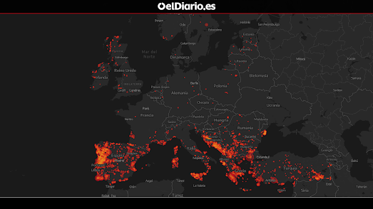
540 million years ago the Earth's climate was very different from how it is today. During the Cambrian period global temperatures were warmer than they are now. It is believed there were no polar icecaps and there was likely to have been high levels of precipitation and humidity over much of the planet. Of course our world hasn't always been so warm. The last Ice Age was during the Pleistocene Epoch, around 20,000 years ago. During this period around 30% of the Earth's surface was covered by ice.

You can explore the history of the world's climate for yourself at the Climate Archive. The Climate Archive is an amazing interactive map which allows you to view animated simulations of the Earth's climate for the last 500 million years. Select an era of Earth's history from the map's timeline and you can view animated layers showing precipitation, wind and temperature conditions around the globe during your selected period.

animated map showing the development of the Earth's continents over the last 540 million years

If you aren't interested in the climate then you can instead use Climate Archive to view the evolution of the Earth's continents over its long history. Just turn off all the animated climate layers (listed under 'Layers in the left-hand sidebar). You can then use the timeline below the map to view the development of the Earth's continents over the duration of the last 540 million years, from the Cambrian period right-up until the Cenozoic (Earth's current geological era).

But forget about the past. I;m sure you are more interested in discovering how the Earth's climate might change over the next 1 million years. Select Next Million Years from the map sidebar and you can view an animated globe showing the Earth's climate "over the next one million years following a brief but strong anthropogenic warming".

two animated globes comparing the Arrakis of now with the Arrakis of 50 million years ago

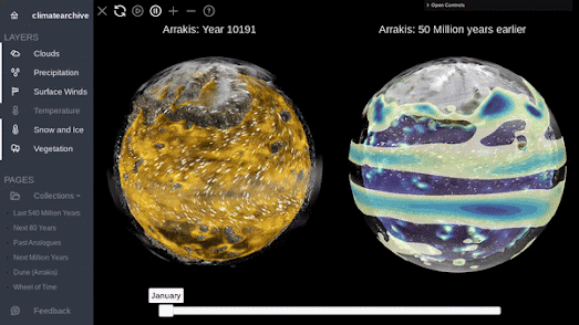
Having mapped out the Earth's climate for the past 540 million years Climate Archive decided to move on to also map out 50 million years of climate change on the fictional planet of Arrakis. Fans of Frank Herbert's Dune series of novels (or the recent movies) will be aware of the tough desert conditions on the planet Arrakis. But did you know that 50 million years ago Arrakis was covered in water?

Select the Dune link in the left-hand menu and you can view a 3D globe of the fictional dry desert planet of Arrakis, as it appears in the novels and the films. You can also view a 3D globe showing the climate on Arrakis 50 million years ago, when 91% of the planet was covered by oceans.

a globe of Radland

After mapping 540 million years of Earth's climate history and 50 million years of the climate on Arrakis Climate Archive also decided to map the climate on Randland (the world which features in The Wheel of Time novels by author Robert Jordan - dubbed 'Randland' by some readers).

The Randland 3D globe features an animated layer simulating the yearly climate on the planet. Having never read the novels myself I cannot testify to the accuracy of this climate model. If you don't think the climate is accurate then you can always use the layers menu to turn off all the climate layers, and just peruse the 3D globe of Randland on its own.